Wikipedia talk:WikiProject Peru/Maps task force
WikiProject Peru
| |||||
| |||||
| IRC | |||||
| #wikipedia-en-wpperu | |||||
| Main pages | |||||
| Main project | talk | ||||
| Peru portal | talk | ||||
| New articles | talk | ||||
| Cleanup articles | talk | ||||
| talk | |||||
| Source reliability | talk | ||||
| Deletion | talk | ||||
| Peru related ACID | |||||
| Article improvement drive | talk | ||||
| Previous collaborations | talk | ||||
| Featured collaborations | talk | ||||
| Previous nominations | talk | ||||
| Peru Assessment | |||||
| Assessment department | talk | ||||
| Assessment bot log | talk | ||||
| Task forces | |||||
| Translation project | talk | ||||
| Images task force | talk | ||||
| Maps task force | talk | ||||
| Congressional project | talk | ||||
| Other | |||||
| Outreach | talk | ||||
| Template list | talk | ||||
| Category structure | talk | ||||
| Notability criteria | talk | ||||
| External links | talk | ||||


Labeled Map

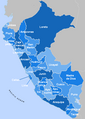
I don't know how to make maps at all but I always thought that it would be a great idea to have a labeled map of Peru linking all of the provinces of the country. To the right of this comment is a labeled map of Mexico to serve as an example.--Jersey Devil 22:08, 12 June 2007 (UTC)
- It certainly is a good idea. I can't make maps either, but the user who created the current map of Peru, Rarelibra says in his user page I am a cartographer - I make maps. If anyone ever needs assistance in creating a map or needs digital files of a map coverage, simply send me an email via Wiki (or leave a note on the discussion page) and I will be more than willing to help. So maybe he would be willing to improve his work to current standards if we ask him. --Victor12 22:23, 12 June 2007 (UTC)
- I find the idea of Jersey Devil very interesting and the information of Victor12 needs a follow-up, perhaps a note to Rarelibra about it by Jersey Devil will be the next step. John Manuel-12:11, 13 June 2007 (UTC)

- Here, there are two maps that can be useful for the task, you dould find them in commons,
.png)
further if you want to access all maps in commons here is the address the atlas of Perú; hope you find this post somehow pertinent but if were not, then I am apologizing for the interjection with some anticipation. John Manuel -"-Todos Llegan de Noche, todos se van de día" 17:40, 13 June 2007 (UTC)
Peru "Labelled" [sic] map
- The idea of User:Jersey Devil, as very frequently happens so, it was done already by other person: here is your map: Enjoy it!

John Manuel-"-Todos Llegan de Noche, todos se van de día" 18:01, 13 June 2007 (UTC)
- It's nice, however it represents Peru divided in departments, administrative divisions which are no longer used. What we need is a map of Peru's regions such as the following:

This is the current administrative division of Peru. As you can see it differs from the previous one in that Callao is an independent region. Also the city of Lima has been excluded from the Lima region. We need a labelled map based on this division. Greetings, --Victor12 22:51, 13 June 2007 (UTC)
- Well explained, lets work on it, -"-Todos Llegan de Noche, todos se van de día" 02:43, 14 June 2007 (UTC)
- hmm the labelled map eeds to be expanded, for having full names, also bckgrd picture needs colors --Andersmusician $ 05:45, 14 June 2007 (UTC)
- I don't think full names will fit. You are right about the colors though, we need a better map. --Victor12 11:52, 14 June 2007 (UTC)
- I've been looking through history and it used to be bigger, now it shows full names in most regions, but I think should be a little bit smaller though --Andersmusician $ 16:36, 14 June 2007 (UTC)
- ¡Cáspita!-- I put the post without seeing the difference, I should say that it is a little big, but always can be "thumbed" or other; however it seems that match very well the regions as they are today, I can see "el Llauca" down there, don't you?" keep with that good Job! Andersmusician. Well let me know otherwise about this map, definitely we can improve it but it seems OK for me as it is. John Manuel _"-Todos Llegan de Noche, todos se van de día" 17:59, 14 June 2007 (UTC)
- What about our 300 miles? should the map "illuminate" the 300 miles of our territorial sea and its limits, specially with the conflicts that we seen to have. -"-Todos Llegan de Noche, todos se van de día" 16:42, 14 June 2007 (UTC)
- The problem with large maps and/or labels can be partly solved by using imagemap tags and defining areas where you can click. Areas must be defined for each region (or province as in the apurímac example above). In this case there is no need to click on the label, but instead you can click anywhere within the area of the region. Eric Bronder 22:56, 14 June 2007 (UTC)
- I like that idea. But we need a better base map to begin with. One with colors would be nice. --Victor12 00:21, 15 June 2007 (UTC)
Another clickable map
- Take a look at the map in political division in Apurímac Region i created some time ago, it does work, it only takes a lot of time to create. Eric Bronder 22:39, 14 June 2007 (UTC). This one is different from the one suggested by "-Todos Llegan de Noche, todos se van de día" in that you can click anywhere within the province (or region in case of peru map) and not only on the shown labels. The positioning of the labels in the previously suggested solution is a bit tricky: try to add a section immediately following the map and see what happens to the labels. unless you explicitly clear all formatting.

- Now, what is wrong with the map that we have, I don't get it? if it needs something let us determine what it is and we should make those changes rather quickly. Even we can make a page to put this map and we can work together or somenthing. Also there is a page that illustrates how to do these labels given a JPG or PNG picture. Lets locate it to make sure we can do this well, if it were necessary. Again I am only suggesting it, you might have better ideas. -"-Todos Llegan de Noche, todos se van de día" 22:54, 14 June 2007 (UTC)
- There's nothing wrong with the map itself, i like it, but i think it would be nicer to use the method used on the apurimac map also on the peru map. Eric Bronder 23:07, 14 June 2007 (UTC)
- the problem of this is that people will probably think that this is an image (because of the layout) & in the other case, links are easily noticeable as each 1-line link --Andersmusician $ 02:48, 16 June 2007 (UTC)
- This can be clearified by adding the blue i(nformation)-sign. Eric Bronder 15:22, 16 June 2007 (UTC)
Proposing: Color-Coded system for the newly Peru "Unlabelled" [sic] map(s)
- I certainly agree with the idea that the new map would look better with the addition of colors to it. The problem remains: What type of colors owed to be used to depict it? Any color for any department or region? With so many departments and so many colors for a proportional small space, we could confuse the readers. I am suggesting to create a color-coded system without using any hue colors or strong values, just soft pastels or light shades of hues, toning nice and calmly like resting the eyes on the entire map.
- I think we would better avoid the accented colors as it was done in the full-colored Peru's map above it. For instance Loreto could be a greenish but in light pastel, like the color 9F9 (see below, open the box) and the other departments or regions, like those in the Rupa-rupa or "Ceja de Selva" like Cusco or Ucayali could be greenish or yellowish; something like CF9 and the other CFO, something like that.
- Therefore, once we are made our mind about each department or region and after we would have had tried some combinations and agree upon the best of it. Then we could create a matrix or table or spreadsheet, whatever you would like to call it [rows and columns], and apply these colors to the map and every other map region, i.e., one color for one region as a standard for our diagrams.
- Furthermore, and again using other words, these same colors could be apply to identify the departments or regions in Wikipedia, for example, Apurimac's color will be the same color as is now since this map has served as example for the purpose of representing the idea of how we can go about in our search for a better way to diagram a represent the maps of Peru. This color will be like hard-color-coding, Apurimac and will represent and committed, color-wise that is, for that department only and not for other.
- Lastly, to facilitate this task, I am presenting in here those colors for you to pick from (just click on "show" below to see the table); they are know as "Web-safe colors", since they work and are compatible with almost all [Web]browsers [of course is someone would use Lynx then the reader wouldn't see any color] or language the reader would like to use. Let me Know what do you think about this proposition. Thanks with anticipation for any comment. John Manuel and my slogan, in case you are confusing it with my username: -"-Todos Llegan de Noche, todos se van de día" 14:50, 15 June 2007 (UTC)
| 000 | 300 | 600 | 900 | C00 | F00 | 003 | 303 | 603 | 903 | C03 | F03 |
| 006 | 306 | 606 | 906 | C06 | F06 | 009 | 309 | 609 | 909 | C09 | F09 |
| 00C | 30C | 60C | 90C | C0C | F0C | 00F | 30F | 60F | 90F | C0F | F0F |
| 030 | 330 | 630 | 930 | C30 | F30 | 033 | 333 | 633 | 933 | C33 | F33 |
| 036 | 336 | 636 | 936 | C36 | F36 | 039 | 339 | 639 | 939 | C39 | F39 |
| 03C | 33C | 63C | 93C | C3C | F3C | 03F | 33F | 63F | 93F | C3F | F3F |
| 060 | 360 | 660 | 960 | C60 | F60 | 063 | 363 | 663 | 963 | C63 | F63 |
| 066 | 366 | 666 | 966 | C66 | F66 | 069 | 369 | 669 | 969 | C69 | F69 |
| 06C | 36C | 66C | 96C | C6C | F6C | 06F | 36F | 66F | 96F | C6F | F6F |
| 090 | 390 | 690 | 990 | C90 | F90 | 093 | 393 | 693 | 993 | C93 | F93 |
| 096 | 396 | 696 | 996 | C96 | F96 | 099 | 399 | 699 | 999 | C99 | F99 |
| 09C | 39C | 69C | 99C | C9C | F9C | 09F | 39F | 69F | 99F | C9F | F9F |
| 0C0 | 3C0 | 6C0 | 9C0 | CC0 | FC0 | 0C3 | 3C3 | 6C3 | 9C3 | CC3 | FC3 |
| 0C6 | 3C6 | 6C6 | 9C6 | CC6 | FC6 | 0C9 | 3C9 | 6C9 | 9C9 | CC9 | FC9 |
| 0CC | 3CC | 6CC | 9CC | CCC | FCC | 0CF | 3CF | 6CF | 9CF | CCF | FCF |
| 0F0 | 3F0 | 6F0 | 9F0 | CF0 | FF0 | 0F3 | 3F3 | 6F3 | 9F3 | CF3 | FF3 |
| 0F6 | 3F6 | 6F6 | 9F6 | CF6 | FF6 | 0F9 | 3F9 | 6F9 | 9F9 | CF9 | FF9 |
| 0FC | 3FC | 6FC | 9FC | CFC | FFC | 0FF | 3FF | 6FF | 9FF | CFF | FFF |
-- "-Todos Llegan de Noche, todos se van de día" 14:50, 15 June 2007 (UTC)
- I rather like the color scheme used in the mexico map. Can we use all different web safe colors in the blue range or will we be using different colors all together? Eric Bronder 15:37, 15 June 2007 (UTC)
- Now, You got me thinking....wait ◄◄..0|0..►► (OK one of my eyes is blinking the other doesn't move at all), therefore, can we use other color range than the one of Mexico it is nice but seemingly monotonous? Also we can use at least two or three colors ranges. We always can make different maps and pick up the best of them by consensus.
- Either way, we would facilitate the task by color-coding each department, and in Mexico's map many are "tabbed" with the same color.
- We can use very light most often ultra-light values from the three hues RGB. Most colors will be slightly and perceptibly different just enough; the map will look heretofore homogeneous, and each department or region will have its own color, which can be used to create their maps and identify them in statistical charts later on, if we were wanted to do so. What do you think Eric?
- for example using "agonizing" mineral light-blues, will be fine perhaps for the saw, very languid light pallid cadmiums yellows and ochers delicate earthly reddish tones can be applied for the cost, and some mellow yellowish greens for depicting accordingly the rain-forest and jungle. The fact, still that we won't know for sure till we watch and contemplate all this, only what we can do is speculate about it at this point.
- We need to look at it, whether we employ one or more hues, lets bring the color-coded map(s) in here, and we shall vote for and pick the best; then, we would be able to proceed with the color-coded table and its scripting, I guess. What do you think? Erick. John Manuel-"-Todos Llegan de Noche, todos se van de día" 17:28, 15 June 2007 (UTC)
- I'm with you on the idea that accented colours should not be used. And the mexico example is a bit monotonous, but let's not forget that a map should not distract attention from the article itself, it should augment the article, not attract too much attention.
- The idea of using different colours for each region is a good idea. We've got to find 26 (including Lima province) colours though. I like the idea of using that colour subsequently for the detail maps of the region's provinces and districts.
- I'll try to make a blue-scheme version of the peru map based on the large one in the "Peru "Labelled" [sic] map" section.
- Let's not forget the maps already created, like all locator maps for provinces and districts, they use the brown-red scheme and some odd ones the grey-green scheme like in other projects.
- Should we continue to define our own PeruProject colour scheme or adopt colour schemes used elsewhere in wiki?
Eric Bronder 21:37, 15 June 2007 (UTC)
◙ The Semantic Maps show that the information is not Flat ◙ or Leonardo's Microcode ◙
- It is an interesting question. But first your rationale is strong and I accepted as not only plausible but followable.
- Now, answering your question, it is at first look, obvious, "I don't think we need to reinvent the wheel", but we need to look if the colors are a big deal after all.
- I think an encyclopedia owe to be delightful, inviting and attractive, but informative and up to the point, there are not an exact way or formula to obtain all of this.
- Perhaps we can envision more quality by reinspecting the ""wheel of colors" and tune our palettes a little bit more. You have done it very well indeed, for instance, with the Peru Wikiproject's logo. It look much better. Ir really does! What I going to write about your logo? It is better, and so it is an improvement over what was done before, that is it.
- Therefore, we should go for it, we might don't change a thing, but perhaps if we would like to expand our geographical aspirations, we need first, work at the lower level by building a color-coded matrix, based upon a simple table, then perhaps, build the respective microformat.
- This project could expand very fast in a very globally and useful ways of depicting and encapsulating, multiple layering data, to aggregate and disseminate several layers of topographical intelligence including real time navigational information from Wikipedia to the users. Google will more than happy if we improve this and we will be better off doing it anyway, because it is fun, and if we don't somebody else might, in Wikipedia, I meant.
- Now, I think that we should go ahead with the color-coding for now, then wait and see. In the mean time we might want to find somebody who knows something about Microformatting well or we might learn to do it as well. Again, I am not referring to templates, those colors look fine and decent, and they do contain the information need it for the tasks for which they were created.
- I am talking about in concentrating for mapping information, taxonomically based on geographical delimitations, containing or embedding multiple layers of information. For giving you a clearer idea, evenly we can linked historical information, not to mention navigational and other sources or feeding as points of reference for the onlookers. In this way we are looking at a map which is more than the territory itself, because it is capable of showing more things than that 2D or 3D information, it is a massive aggregated, a condensed directory, that include most of the objects that we know or have the capability to know that have existed or are existing inside its boundaries. Now, I am imagining that Alfred Korzybski is jumping about all this. I call it the semantic map as a matter of fact "Korzy" started to do something on this regard, and Tim Berners-Lee is following him up with the Semantic Web, "We can go in-line with them by working on-line on the topic." It can be done, in the exercise to depict: Verifiable, published by authorized reliable sources, neutral facts and information. All of what could and should be encapsulated in a map. Therefore, with one wheel at the time, we could make a car and then the wings so we can fly looking at our territory or evenly virtually visiting a neo-geo-reality based on our wikimaps" ◙ JMK ◙ What do you thing, Erick?
John Manuel K. -"-Todos Llegan de Noche, todos se van de día" 00:44, 16 June 2007 (UTC)
(main talk GAP)
Peru regional clickable map using the mexico blue colour scheme
-
 First Blue Map
 -
 "Labelled" Blue map

The map which wouldn't be resized

- ►► My points: Mentioned earlier: This map is difficult to resize, the other has difficult-to-read white labels. It is your call. John Manuel-"-Todos Llegan de Noche, todos se van de día" 17:44, 20 June 2007 (UTC)
I've created the blue scheme peru regional map based on examples above. The clickable property has been implemented for 4 regions: Loreto, Apurímac, Ancash and Madre de Dios. The example is shown scaled down to 300px wide. Eric Bronder 22:31, 15 June 2007 (UTC)
- Well you almost got 26 blues in there, I like it. Perhaps if you can tweak some of the accented blues by lighten then with higher yellows in there; however and definitely, it is good and it looks good too. I will wait what our other counterparts would state about it. But I will go ahead and write for you Good job Erick! You deserve a barnstar. Seeing it is believing it. Well, probably, we need to finish it out and you just and only for formality reasons, might want to made the official motion for its official application. "Peru's Blues "Unlabelled""[sic].John Manuel -23:05, 15 June 2007 (UTC)
- I like it very much. Great job! I was wondering if we should put the names of the regions in it. Perhaps just three-letters for each one for space reasons. The map also needs to depict Callao Region and Lima province which is not part of any region. --Victor12 23:42, 15 June 2007 (UTC)
- As a follow-up new initial map and map with 3-letter codes for the regions, i'm not yet 100% satisfied though. Eric Bronder 13:13, 16 June 2007 (UTC)
- A smaller font size would be nice, as in the map of Mexico. --Victor12 14:20, 16 June 2007 (UTC)
- Smaller font looks much better indeed. Most names now fit. Eric Bronder 15:06, 16 June 2007 (UTC)
- Shouldn't we use the same format for all names? That is either full names or just three letters. I'd like to see full names, even if they spill a little into neighboring regions. What does everybody else think? --Victor12 18:06, 16 June 2007 (UTC)
- Wow, an idea spoken about in this talk page is actually being worked on. O_O So far everything is looking good.--Jersey Devil 18:18, 16 June 2007 (UTC)
- New all names example now included. The ALLCAPS codes are a bit heavy indeed. Eric Bronder 21:47, 16 June 2007 (UTC)
- Looking good... Perhaps Amazonas, Apurímac and Huancavelica could go in two lines instead of one (Ama-zonas, Apu-rímac, Huanca-velica). Also, Madre de Dios could fir in two instead of three lines. --Victor12 02:24, 17 June 2007 (UTC)
complexity
- I strongly question the function of this, since links are hard to see (for the average user), now I think the 1st labeled map without colors would be better, but if you decide, just go on guys ...--Andersmusician $ 01:46, 17 June 2007 (UTC)
- Perhaps this issue can be solved by using an appropriate caption such as "Clickable map of the regions of Peru" or something like that. --Victor12 02:26, 17 June 2007 (UTC)
- The (I)-icon has been added to indicate that it is a clickable map, i'm not sure whether or not the average user recognises this. But using it more and more makes it better known. Eric Bronder 10:44, 17 June 2007 (UTC).
- I've now included an example of the "classic" labelled map but with the blue scheme map as the base map. Just a quick and dirty try to see what we think of it. The *least* that should be done is extend the posibilities of the Image label to accept a font-color which in our case should be white.
- Personally i don't think we should drop the coloured base map, but still use the blue scheme base map or a base map with different colours for each region as proposed by John Manuel.
Eric Bronder 10:44, 17 June 2007 (UTC)
The Map is not the territory is the team

Still thinking... John Manuel-15:34, 18 June 2007 (UTC)
- so all this discussion should be moved to Wikipedia:WikiProject Peru/Maps task force?--Andersmusician $ 17:22, 19 June 2007 (UTC)
- I agree. What does everybody else think? --Victor12 17:52, 19 June 2007 (UTC)
- It was long overdue. Just keep a link to it in here, "all this" can be soon forgotten.John Manuel --13:31, 20 June 2007 (UTC)
Suggesting to focus only on the colors first
- Labels and sizing will come after. I like the blues of Erick, and it is fine with me, but I giving you more colors to have our own version of this type of "labelled" maps.
-
 #1
#1 -
 #2
#2 -
 #3
#3 -
 #4
#4 -
#5
-
 #6
#6


-- I believe that it has come the time to vote.
John Manuel-"-Todos Llegan de Noche, todos se van de día" 21:35, 18 June 2007 (UTC)
fixed

The image before had glitches, I am inputting a new one, with 300px, if is to big, please change its size, thanksJohn Manuel-"-Todos Llegan de Noche, todos se van de día" 02:56, 19 June 2007 (UTC)
Votes on Map Colors
- I vote for #5. #4/6 look good but there are some contiguous regions that have very similar colors, for instance Loreto-Amazonas, Huanuco-Pasco and Tumbes-Piura. --Victor12 15:38, 19 June 2007 (UTC)
- I'd vote for #5, but if its contrast would be reduced, its brightness increased, and preferably, its hue changed to a non-blue color, so links (that use to be blue all across this wiki) would be recognizedeasily. --Andersmusician $ 17:18, 19 June 2007 (UTC)
- Proposing Second round: So it seems that we are getting closer, but we are not satisfied enough about it. I think that after a couple more votes that should include at least those of Jersey Devil and Erick, we probably has to come back to the "bench" for work on a second improved version of each one: The Blue #5 and the Colored one #6. So probably the election should be done between those two versions. Now, this is a suggestion, since, Jersey Devil and Erick need to state their votes or views in here before we could go for it or else the three of us coul approve it and Erick accept it, to carry on with it. My Vote, having read Victor12's and Anders' views, is for a modified version of #6, only because its labels can be resized in conjunction with the whole aspect ratio of the image; thing that seems to be difficult with the other versions, albeit we can do this with the blue version, i.e. embedding fonts in it; but Anders, altogether, seems to be alright about the colors of the WikiLinks. Now, I'm pointing to the labels in the sense that they are embedded part of the graphic from which a simpler resizable and clickalble map can be built. As you can see in here. Again, I will wait for your, Erick, and Jersey Devil or others take on this, in here. John Manuel-"-Todos Llegan de Noche, todos se van de día" 18:06, 19 June 2007 (UTC) || -22:58, 20 June 2007 (UTC)
After seeing both versions I'd vote for #5. I don't really understand the remark about resizing the labels though, with both examples being just png's with labels in the png. About the type of label i'm still open to suggestions, either the clickable map with areas or the base map with {{Image label}} *white* labels. Eric Bronder 01:01, 20 June 2007 (UTC)
- Well, we shall talk later about the labels. With respect to the votes: I am counting the following:
- #5 = 2 votes
- #6 = 1 Vote
- 1 vote in blank - requesting for changes and suggesting explicitly using other color than blue.
I think we should let it rest for a while, but not for long: 1st: The Vote of Jersey Devil is important his suggestion started this initiative, and 2nd, We probably need to wait at least for 24 hours (after Jersey's vote that is) to see if anybody else will pick a vote in any map. I'm sure that either way, a modification will follow-up. But at the end of the day, we will have a better map, and a map that was selected by our effort and consensus. Which is in part the whole point about enjoying a democratic and civil process. OK Erick, we just started at the lowest level, let us see where, when and how we should end up. It seems that all we have the enough patience and cooperation to the best. John Manuel-"-Todos Llegan de Noche, todos se van de día" 01:30, 20 June 2007 (UTC)
- I vote for #5.--Jersey Devil 04:18, 20 June 2007 (UTC)
- Final count:
- #5 = 3 votes
- #6 = 1 Vote
- 1 vote in blank - requesting for changes and suggesting explicitly using other color than blue.
The Map that Would be Blue
► If there were not new votes till 04:18, 21 June 2007(UTC) or any objection (I don't have one). The Map will be the blue #5.◄
John Manuel -11:08, 20 June 2007 (UTC)
LAST CHANGES AND MODIFICATIONS FOR "CURATORIAL" PURPOSES WERE DONE TILL -12:08, 21 June 2007 (UTC)
The Map is Blue #5 now the Labels and size
Suggestions:
- Clickable white labels
- Clickable areas
...
John Manuel -"-Todos Llegan de Noche, todos se van de día" 12:08, 21 June 2007 (UTC)
Map with clickable white labels
Map with clickable areas (19 areas so far)

- I like the second one better. Some Peruvian regions are quite large (Loreto for instance) so it is useful to have links for the whole territory. Great job BTW, --Victor12 18:12, 22 June 2007 (UTC)
- If we only can get all the regions with the labels of the first, that will be ideal, somehow I like the labels of the map at the top. Can we do that? if not lets us use the second map, Lets see what others have to say about this. -"-Todos Llegan de Noche, todos se van de día" 18:36, 22 June 2007 (UTC)
Map with clickable white labels AND clickable areas (ALL areas)
Positioning of the labels is not tuned yet. You can check the label at for instance Cusco Region to see that the labels really work. For the Cusco Region i have not yet defined an area. For the time being i'll continue with this combi-map. Eric Bronder 18:51, 29 June 2007 (UTC)
OK, this should be it. Eric Bronder 17:43, 30 June 2007 (UTC)
Sizing still does not work. The labels scale to right size, but image remains default 300px!? Eric Bronder 17:45, 30 June 2007 (UTC)
Revised version of blue map with detail view for Callao and Lima province
I've created another version the blue map, with an detail view of Callao and Lima province. Is this an improvement? One thing it does is making it easier to click on the areas of Callao or Lima. Eric Bronder 18:55, 25 June 2007 (UTC)
- Certainly an improvement. BTW, could you use on this map the sharper white letters of the "Map with clickable white labels". --Victor12 19:39, 25 June 2007 (UTC)
- I STILL insist on changing its hue to a non-blue color (know what hue is?) user:andersmusician --201.230.122.42 20:30, 25 June 2007 (UTC)
- An Improvement. We have already vote on this, why we need to comeback to the same issue? If you want to vote again, I will render a second version of the colorful map and we vote for a second round. The blue map is alright, now we are in the issue of labels and resizing. The map still is not clickable as yet.
PD. To understand what is hue see here Hue. John Manuel-21:52, 25 June 2007 (UTC).
Different hues for peru clickable map
OK... here are some different hues for the peru map. Now why would they be better than the blue one? I like the blue one.
-
 #wine
#wine -
 #earth
 -
 #lime
#lime -
 #mint
#mint -
 #green
 -
 #oker
#oker


Eric Bronder 21:46, 25 June 2007 (UTC)
- Have you checked the colors of this really cool map of Germany? {{GermanyImagemap2}} --Victor12 21:59, 25 June 2007 (UTC)
- IMO Blue isn't good at all since it doesn't contrast with links (which already are blue), but if you don't agree please let's discuss on that.--Andersmusician $ 22:48, 27 June 2007 (UTC)
Of the Hues and On the Maps

- I am, definetely, leaving tomorrow, who really knows what it would happen to me, my interactions, would need to drop, but before I leave, I am presenting my last version of a "colorful Map of Peru". Erick could continue working with it, if you decide, [it is] worth it. Well thank you, for the interactions, and I would try as much as I can to communicate with you via IRC and of course over these pages, here is the map:
Keep your good work! ◙JMK◙-"-Todos Llegan de Noche, todos se van de día" 14:36, 26 June 2007 (UTC)
- Our map task force page looks good in Firefox. I don't know how it looks in IE over windows Vista or XP and the like, I don't use much neither of those. Please, check it on that browser and those OSes, and make the respective changes. I wonder for the top part since the rest of the page will most likely parse well. Just this is a note FYI. -"-Todos Llegan de Noche, todos se van de día" 14:53, 26 June 2007 (UTC)
- PLease Please Please JohnManuel DO NOT make this more complex... mercy on us--Andersmusician $ 22:45, 27 June 2007 (UTC)
- I'll continue with the bluemap for now. Some time in the future we'll have to make a template for the whole picture and its implementing code. We already use the {{Peru Labelled Map}} so we should create another template like Labelled administrative map of Peru because (maybe) it will not be a classic labelled map. Eric Bronder 21:04, 28 June 2007 (UTC)
- Great, I can't wait to see it finished. --Victor12 21:21, 28 June 2007 (UTC)
Sincere Thinking about "Group think"
Go get, do as you think is the correct way to do in this regard or in any other. I just want to document that I am not agree in the way you are conducting the project business in here. I wish you good luck and I am asking you, and not to others than you, to remove my name from the Wikiproject Peru and its subpages. Hope you are happy, After what I have read in my user_talk page and now that your are imploring me in here. It is a rotund and profound way to thank you and leave you alone in whatever you want to do with this project.
- This doesn't mean that I would not comeback and comment on your deeds, modified or actively be involved in Wikipedia, also it doesn't mean that your are my enemies or I consider you as complex, outlaws, let alone vandals or meatpuppets, nope. It means at the moment, I do not agree with the "subculure" that you have developed among yourselves, and I believe that for such "eco-digital phenomena", there is not a rational or functional way to deal with you or determine what is best for our articles, because the users that currently are collaborating in trying to do so are much like what each other is doing, listen sometimes happens and it is difficult to see it once you are "in it".
- Moreover, This, an official disagreement, it doesn't mean more than this, feel free of supporting the behaviors that you are supporting by your silence or by your lack of objections.
- In addition, time we tell us everything if we listen well to it, so I will not comeback to these pages for awhile, perhaps one month or more. Hope you will have more people, that are not related in anyway or know each other, or even agree with you, and even though decided that they can collaborate.
- In summarizing, when I opened an account in this version, I sought more than couple pages that were really a disaster, when I start to fix them, and improving them, certain vandals start to revert it and obfuscating what I had had done, suddenly these pages long forgotten became somehow frequently visited, Why?
- All of what took work, effort and communication, and was finally fixed, I evenly remember giving my first barnstar to one of the members of this project who indeed assisted me, I didn't ask this person to do it so, to fix one of these changes from people that didn't at all belong or had something to do with Peru, but were for some or other reason compelled to work in these pages. Since that point I decided to work together as I am working with others in other projects or issues.
- Can you see? In managing change, there is always a friction, and of course there is a need for time to devote to the issues that become of importance, and sometimes personal for some users. It is like "I/we Own this" attitude. However, there is many ways to deal with this, one is by voting and the other, even better, it is to gain consensus by taking the time to understand and then to be understood.
- There is not consensus, though as there is not democracy in either: the dictatorship of one man over the others, or of one "oligo-group" over one or others. Nope! e.g., because Galileo was stating something unpopular for the common sense of his times, he was wrong, in fact we know he was right.
- I've more than sensed a lack of openness in here, over a period of time, and I am not talking about the younger members of this project, they are just misguided by their presented inexperience and perhaps for what they have inherited from MTV and their social upbringing, nevertheless, they are trying to vandalize the spirit of this noble enterprise and worst they are doing this intentionally. Who really, knows if these are really kids as they has stated they are. But I am talking about members that are seasoned and need to know much better, the policies and about how to preserve the spirit of motivation an collaboration in every project, in every place there are commissaries but very few or none prophets.
- I always hope the best for your endeavors, here in Wikipedia and in other places as well. I will comeback, when I will observe the dynamism that there is or ought to be in every collaborative effort, when it is transparent and for such spontaneous, based upon in good faith and will to do the best for presenting what is the best in the most neutral way. The best, now, is for you to work within yourselves, taking the decisions that most appeal to you and denying other views access or consideration to the decision-taking-process of this project. OK, Keep that good work then. Joh Manuel-12.16.152.142 17:55, 29 June 2007 (UTC)
you spanish wiki people think you can do anything at your willing, also, you've placed this in the wrong place--Andersmusician VOTE 16:32, 2 July 2007 (UTC)
- My apologizes, I didn't meant to be rude. On the other hand, I strongly disagree your comment on "group think", in my case my decisions are from and for my own, no external influences.--Andersmusician VOTE 16:13, 13 July 2007 (UTC)