Wikipedia:WikiProject Maps/Conventions/Gradient maps
This article may require copy editing for grammar, style, cohesion, tone, or spelling. |
This page provide conventions for the creation of gradient maps.
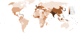
Gradient maps (scientific name: Choropleth) are a light and basic visualisation of spacial areas and their associated values for a single thematic issue, by example the population density by country. Gradient maps need 3 key things: 1. a solidly sourced list of regions⇔values for one issue, 2. a map displaying these regions, 3. a sequential color ramp for legend. This style is conveniently derived from [location maps] style. This style purpose is to illustrate articles including a table of values by regions, thus giving an helpful visualization to understand the data within it's spacial and relational context.
Usage: These maps are final products, usually not reused to generate more complex maps.[1]
Where: gradient maps can currently be found in the Category:Gradient maps. When you create a such map, please tag your upload with Category:Gradient maps.
Convention
| Subject | Colorimetry (RGB/hex) |
|---|---|
| Landmass without values | #E0E0E0
R:224 G:224 B:224 |
| Water bodies (ocean, sea, lake) | #FFFFFF
R:255 G:255 B:255 |
| Border. Labels (country/state/province's name) | #646464
R:100 G:100 B:100 |
| Area (country, province, etc.) — color depend of value For manual creation: on the right are 9 colors from ColorBrewer, adapt the ramp to your needs |
#FFF7FB
R:255 G:247 B:251 #ECE7F2
R:236 G:231 B:242 #D0D1E6
R:208 G:209 B:230 #A6BDDB
R:166 G:189 B:219 #74A9CF
R:116 G:169 B:207 #3690C0
R:54 G:144 B:192 #0570B0
R:5 G:112 B:176 #045A8D
R:4 G:90 B:141 #023858
R:2 G:56 B:88 |
|
Naming (upload):
Note: all the subject, the areas' level, and the date (YYYY or YYYY MM DD) are critical. Ex: Average income per household by US state (2011).svg | |
|
Further needs: | |
| SVG template: if you need some labels, please use Image:Maps_template-en.svg which provide further label conventions. | |
Motivations
- Stake
Gradient maps are both at the center and at the basic level of map making on Wikipedia. A simple blank map and fill with color tool are needed. To continue to build a coherent Wikipedia display, this page suggests the most suitable SVG source files together with a blue-based color ramps from academic, screen friendly, print friendly, and color-blind friendly ColorBrewer2 by cartography theorist Cynthia Brewer. The matching the sourced data to a legend is then up to you.
- Risks
Gradient maps are both easy and difficult to read. Easy because it's usually clear to associate darkness with higher values and lightness with lower values. However, several pitfalls remain: First, the scale matters a lot. Most data has rather irregular data distributions. By example, for population, China and India are about 4.5 and 4 fold more populous than the 3rd country (weight: 1), so 2 countries occupy the space 1>x>4.5, while near 180 countries occupy the 0 to 1 part. This is problematic when trying to use a simple scale, and thus needs a logarithmic scales as that allows the use of the whole color ramp but also sets the USA as almost the same color than India. The reader need to carefully consider the legend and its linear or logarithmic nature. Secondly, the space-unit relationship matter more for a gradient map of population, and population density will generate very different feelings and interpretations, one city may make a large sparsely populated area appear densely populated. Third, the color matters. Some colors have positive or negative meaning depending of your culture (red is aggressive for Westerners, happiness for East Asia). It has been argued that rainbow gradients should be avoided, based on cultural and eyes different interpretations, in favor of light to dark gradients.[2] Last, all the unit, the source, and the years are core informations to gather. An household is different from a person, income in nominal US$ is very different from parity purchase power US$, 1930's nominal US$ are very different from today nominal US$, etc.
History and current work
- History
Gradient map are, from the beginning, and the center of Wikipedia's maps creation. There have been in used "for ever", since they are logical solution to display data (table of values?) where each spacial area is associated with a given values. Most frequently on Wikipedia, a gradient map is a one-theme worldmap displaying the countries of the word, where each country is assigned a given color according to the data available for this theme. By example GDP per capita by country, Population density per country. It can also go on lower levels, such as Population density per province in PRC.
- Interesting technical issues
World gradient maps are better derived from File:BlankMap-World6.svg. For other areas of lower levels, the location maps are a first tool. For better svg's codes or automatization, QGIS and SVGSimple are great helps. Indeed, Gadm.org can provide the needed GIS data, please see Gadm.org on this page. While most current usage are in .png format, .svg is encouraged for it's comparative advantage of scalability.
- Innovations
- Leading place
Currently [2012/09], Arthur Gunn assisted by Yug and concepts from cartography Professor Cynthia Brewer's ColorBrewer2.org are pushing and developping an online app to receive data, generate an elegant SVG gradient map, and save its data and settings. The project is done in accessible technologies (HTML, CSS, JS / D3.js) in order to let Wikipedia contributors lead the project after Arthur's initial and major push. The project have a huge potential since the decisive GIS data available online may be convert to JSON format and feed this D3.js app with all kinds of backgrounds, areas and items. While most gradient maps on commons aren't categorized as 'gradient map' or any map style, the largest collection them can be found in Category:Gradient maps.
Examples
- Examples (toolkits)
|
|
- Basic usages
-
 Internet (2007. Example on how not to compose a choropleth map: use ratios, not absolute numbers)
 -
 Internet (2009)
 -

-
 Alternative color. Population density


Using GunnMap
- Technologies
GunnMap is an online app coded using accessible technologies, namely HTML, CSS, JS, and D3.js, and under CC-by-sa license. This accessible technologies allow programmers to easily suggest code improvements or new functions.
- Usage
Currently for world maps, where countries are associated with polygons and have for id their iso names. The code is actually compatible with any well and strictly coded administrative map where administrative/given areas are represented by a given polygons with a conventional and understandable id name. To generate such well coded map, QGIS and SimpleSVG are very helpful.
- Upload to Commons
GunnMap suggests you a code to copy-paste. {GunnMap}
See also
- Gunnmap App — JS/HTML/D3.js map application. You input your data country by country, it generates the gradient map.
- ColorBrewer2.org for sequencial, diverging, and qualitative color ramps. Web, print, and colorblind friendly.
- Color ramp : list of colors' names and RGB values
- Choropleth map
- Cynthia Brewer
Notes
- ^ A possible exception of mixed map could be a population density and relief map, but such maps are rarely met. This is due to a practical reason, basically, gradient maps are huge simplifications by large area such whole countries. Put such simplification in parallel to fine relief maps, or fine density maps simply make little sense.
- ^ Skau, Drew (2012), Dear NASA: No More Rainbow Color Scales, Please
Map conventions and Map Project | |||
|---|---|---|---|
 | Conventions set |
|  |
| Drafts | |||
| Others |
| ||